This article exhibits my highly opinionated approach to design. How I turn this beautiful mockup into code?
🌐 Live Demo
Table of Contents
Tech Stack
This code example is built on top of:
Proof of Concept
What is Responsive Web design?
Responsive Web design is the approach that suggests that design and development should respond to the user’s behavior and environment based on screen size, platform and orientation.
Smashing Magazine
As long as it can respond to screen size, platform and orientation, it’s Responsive Web design. And it doesn’t have to be CSS media query.
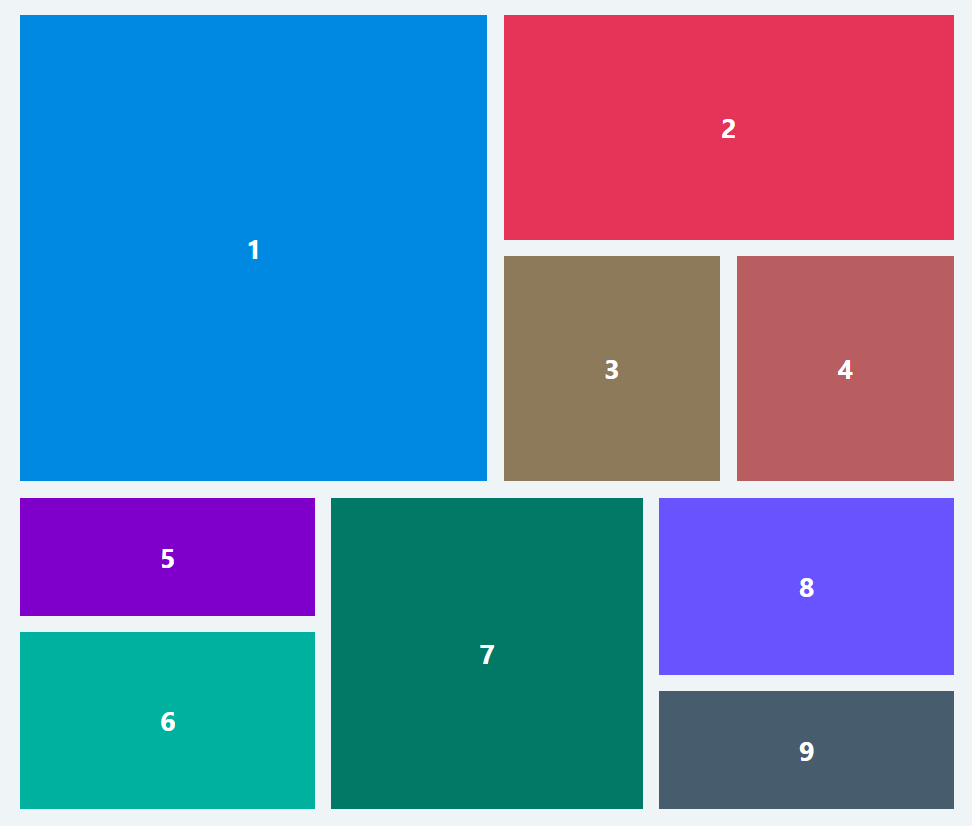
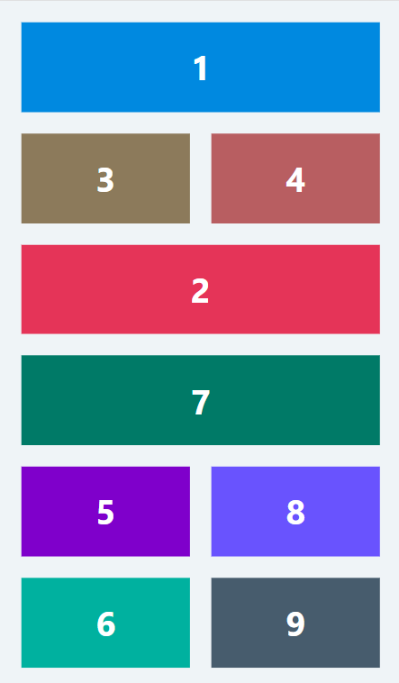
In the real world, a lack of compatibility and consistency between mobile and desktop layout is commonplace, just like that mockup above. Therefore, I prefer to separate the code for mobile and desktop.
If we are to seperate the code for mobile and desktop, how it responds to screen size or orientation? Meet our friend resize event listener. The snippet below is a React hook that listens to window‘s resize event. It will emit current width whenever users change the screen size or orientation and passes it down to consumers.
import { useEffect, useState } from 'react';

const useViewport = () => {
  const [width, setWidth] = useState(window.innerWidth);

  useEffect(() => {
    const handleWindowResize = () => setWidth(window.innerWidth);
    window.addEventListener('resize', handleWindowResize);
    return () => {
      window.removeEventListener('resize', handleWindowResize);
    };
  }, []);

  // Return the width so we can use it in our components
  return { width };
};

export default useViewport;
Browser waits for window‘s resize event listener to take place. After width emitted, our app will decide which chunks (mobile or desktop) should be fetched and rendered on the screen. It only fetches chunks that it needs. As little chunks as possible.
Here’s the code sample:
import React, { lazy, Suspense } from 'react';

const Desktop = lazy(() => import('./Desktop'));
const Mobile = lazy(() => import('./Mobile'));

const Home = () => {
  const { width } = useViewport();
  const BREAKPOINT = 600;

  return (
    <Suspense fallback={null}>
      {width < BREAKPOINT ? (
        <Mobile />
      ) : (
        <Desktop />
      )}
    </Suspense>
  );
};

export default Home;
Conclusion
This approach will make you stick to good old separation of concerns. Any changes on desktop layout will not affect mobile layout. It also goes the other way round. My friend and I can work on both layouts in parallel without conflicts.
What are the drawbacks of this approach?
- It heavily relies on JavaScript. If users disable JavaScript, then this so called approach will be useless.
- It seems like we work twice but actually it’s a good investment.
